
April 10, 2016 Joshua Ruskin
7 Ways to Optimize your WebsitePart 2
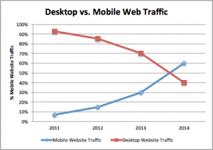
- Make Your Website Mobile-Friendly.Mobile devices and tablets are the future. If there ever was a single “silver bullet” that would increase your conversions and improve your customer optimization making a mobile-friendly website would be it! Searches on mobile devices now exceed searches on desktops and laptops and mobile web adoption is growing 8 times faster than web adoption did in the 1900’s and early 2000’s (http://resources.mobify.com/50-mobile-commerce-stats.html). Further search is the #1 mobile browser activity.

This is only the beginning as more and more people in America, and the world, get smart phones and go online. Research from Pew Internet Project’s (http://www.pewinternet.org/fact-sheets/mobile-technology-fact-sheet/) shows as of January 2014 56% of American adults have a smartphone and 63% of cell phone owners go online. Further, many studies show that mobile users spend more money per purchase than users on desktops do.
According to Google 57% of users say they won’t recommend a business with a poorly designed mobile site. 41% have turned to a competitor’s site after a bad mobile experience. Google further explains spontaneity plays a major role in shopping and accounts for 81% of smartphone purchases. This finding is also confirmed from Mobify Research and Development (http://resources.mobify.com/50-mobile-commerce-stats.html) claiming 70% of PC search tasks are completed in one week vs. the 70% of mobile search tasks that are completed within one hour.
Mobile purchases are often impulsive and customers spend less time researching because they are often on-the-go. However, with this new type of on-the-go shopper comes less patience. 30% of mobile users will abandon a purchase if the shopping cart isn’t optimized for mobile devices and 57% of mobile customers will abandon your website if it takes more than 3 seconds to load.
Google’s research also indicates that tablet owners, on average, make $63,000 a year and 72% of them make purchases from their devices on a WEEKLY basis. Further, according to Adobe, when tablet users spend money they spend 50% more than PC owners do and that they are three times more likely to purchase than even smart phone users!
Clearly this statistics create a crystal clear case for why you want to have your website optimized for both smart phones and tablets. The truth is if your website isn’t responsive you are losing sales. Google paints a clear picture when they say if you don’t have your website optimized for tablets and mobile devices it’s like your store is closed for one day a week, talk about killing your customer optimization metrics. The crazy thing is according to Forbes (http://www.forbes.com/sites/groupthink/2015/05/15/can-your-business-survive-googles-mobile-geddon/) right now 90% of small business owners do not have a mobile-friendly site! Therefore, this is the one silver bullet that can dramatically increase your conversion rate and improve your website’s customer optimization.
Mobile and tablets now have more searchers than desktops and laptops and this number will only continual to grow in the future. Further, mobile and tablet users spend significantly more on their purchases and make those purchases much more impulsively. Knowing this, it’s imperative that you optimize your website so that it’s responsive to mobile devices and tablets but if that wasn’t reason enough see reason number two for why you want a responsive website.
- Adhere to Google’s “Mobile-geddon” UpdateGoogle’s mobile-friendly update came out in April 21, 2015. This update basically punishes all websites that aren’t responsive/mobile-friendly and rewards the website that are. Because of the extreme increase in web traffic with mobile and tablet devices Google has released this update to ultimately give their user’s a better user experience because Google’s future relies on quality control.
Google wants to give their user’s the best user-experience possible to make sure their users continue to use Google rather than the many other search engines that are available. Here is what Google has to say on this matter, (http://googlewebmastercentral.blogspot.com/2015/02/finding-more-mobile-friendly-search.html) “Starting April 21, we will be expanding our use of mobile-friendliness as a ranking signal. This change will affect mobile searches in all languages worldwide and will have a significant impact in our search results”.
Because of the ever-increasing move to mobile devices you can bet that Google will continue to push more and more of these updates until there are major shifts in the market because, as we know right now, 90% of businesses don’t have a mobile responsive website. These new updates from Google mean that not having a mobile-friendly website doesn’t just hurt your mobile traffic but also all of your web traffic! Now, more than ever, as more and more internet users browse with their smart phones and tablets versus their laptops and desktops it becomes imperative for you to get your website mobile-friendly before your SEO rank, and overall customer acquisition, takes a massive hit that you can’t recover from.
I mentioned this point in much more detail in one of my later blogs Mobile-geddon. If you would like a further explanation regarding Google’s recent update you can read about it here: (Link). I also have a video that explains in detail what website responsiveness is (need Youtube video).